

The focus of this project was the transfer process of the findings from text design and layout to haptic media. The focus was on the integration of prepress, press and postpress.
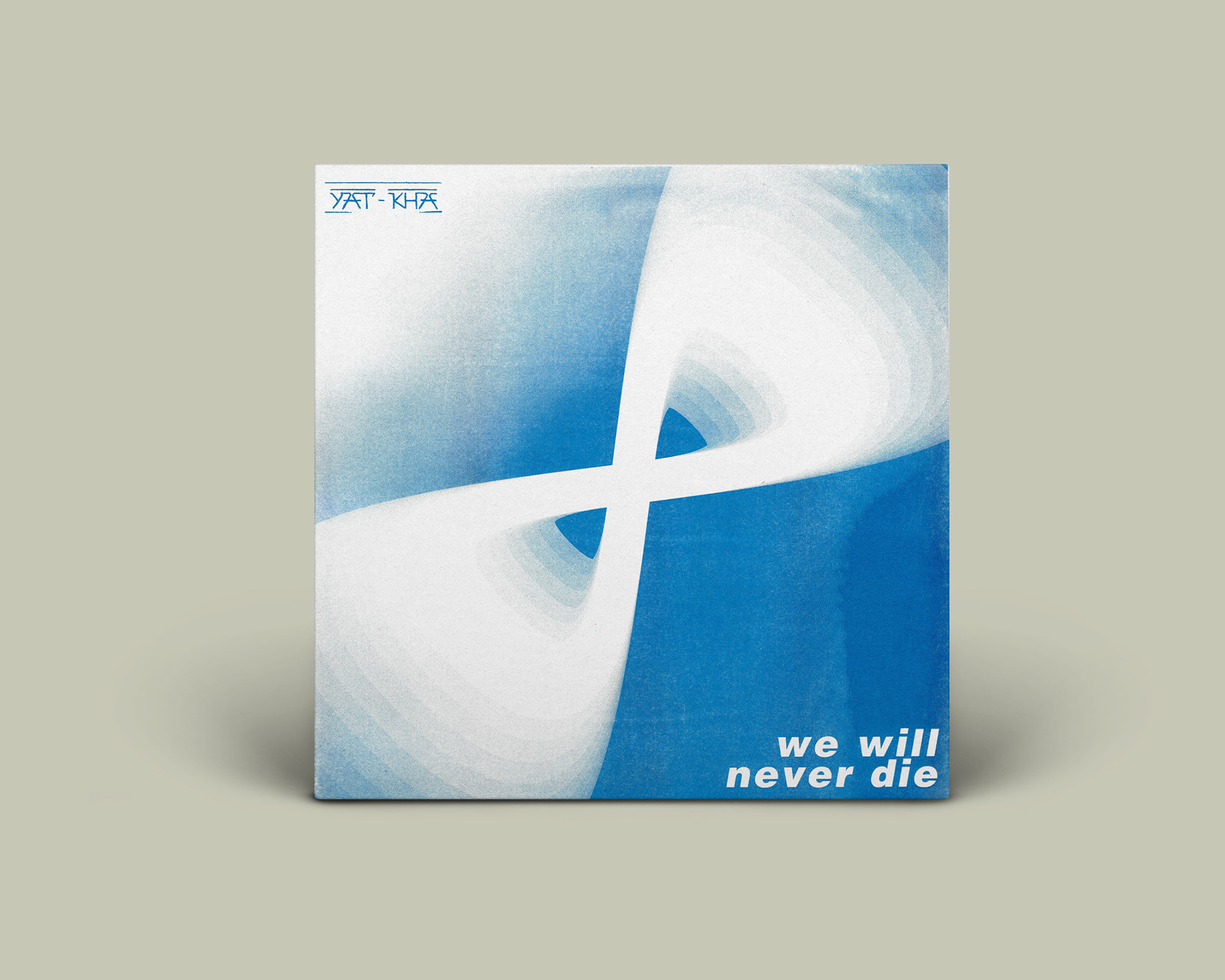
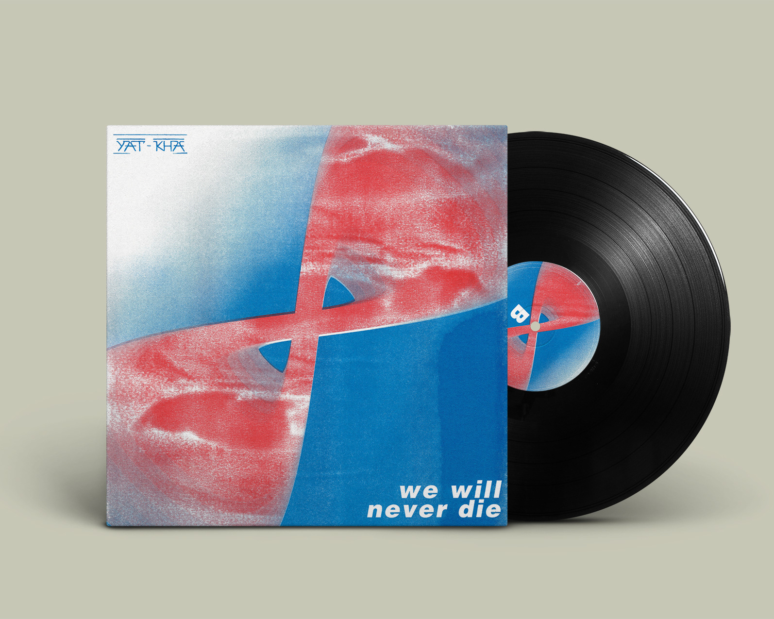
This semester we had the great pleasure to design and produce for Lollipop Shop / Henning Küpper (Berlin) as a client for the special edition LP (vinyl) of Albert Kuvezin & Yat-Kha (Ят-Ха) - "tuva.rock" from Tuva (Siberia) and the best throat singing of Central Asia.
As for the printing method, we chose the risograph, as it is both more sustainable than traditional printing but primarily due to the unique printing profile it creates.
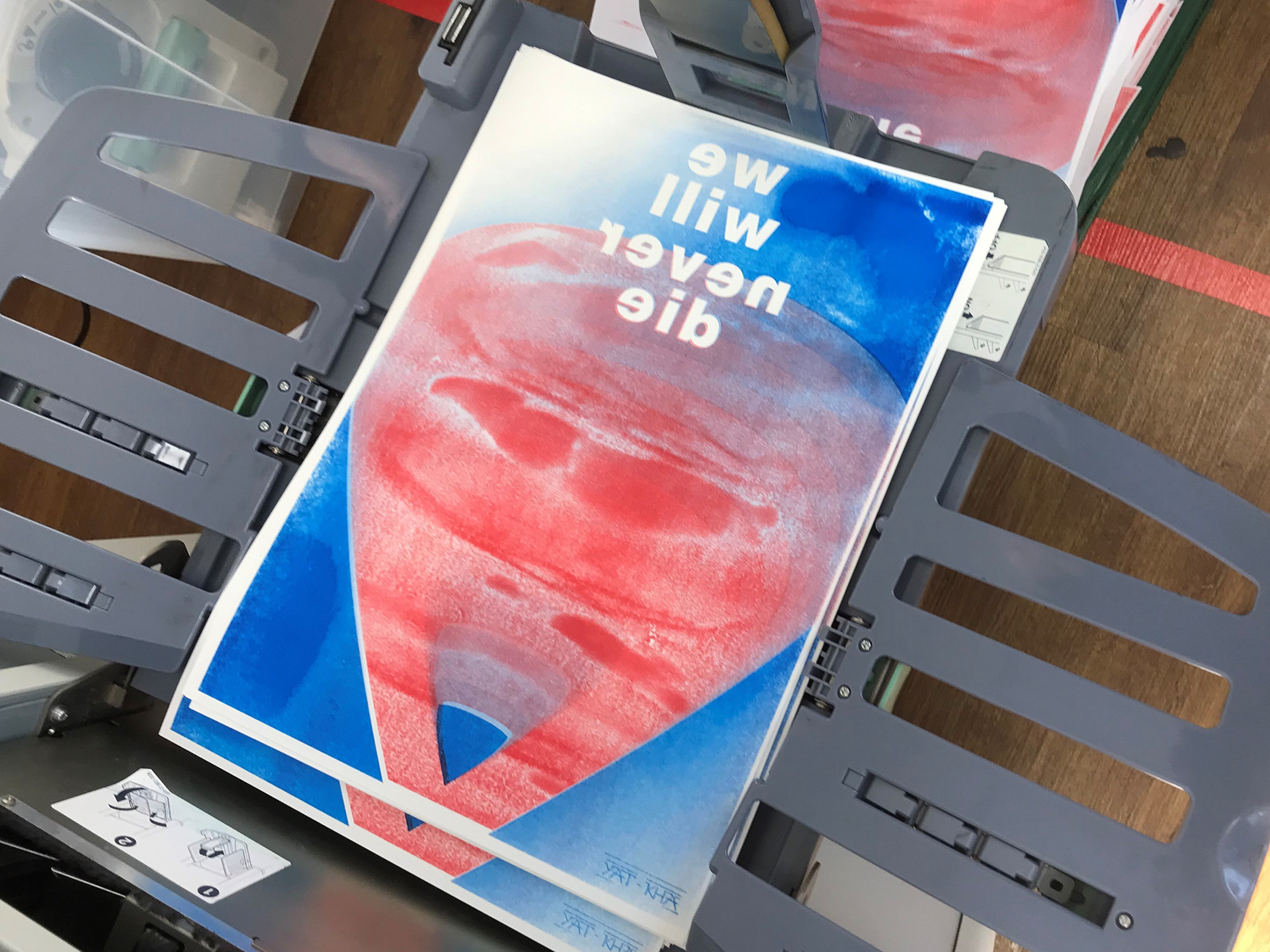
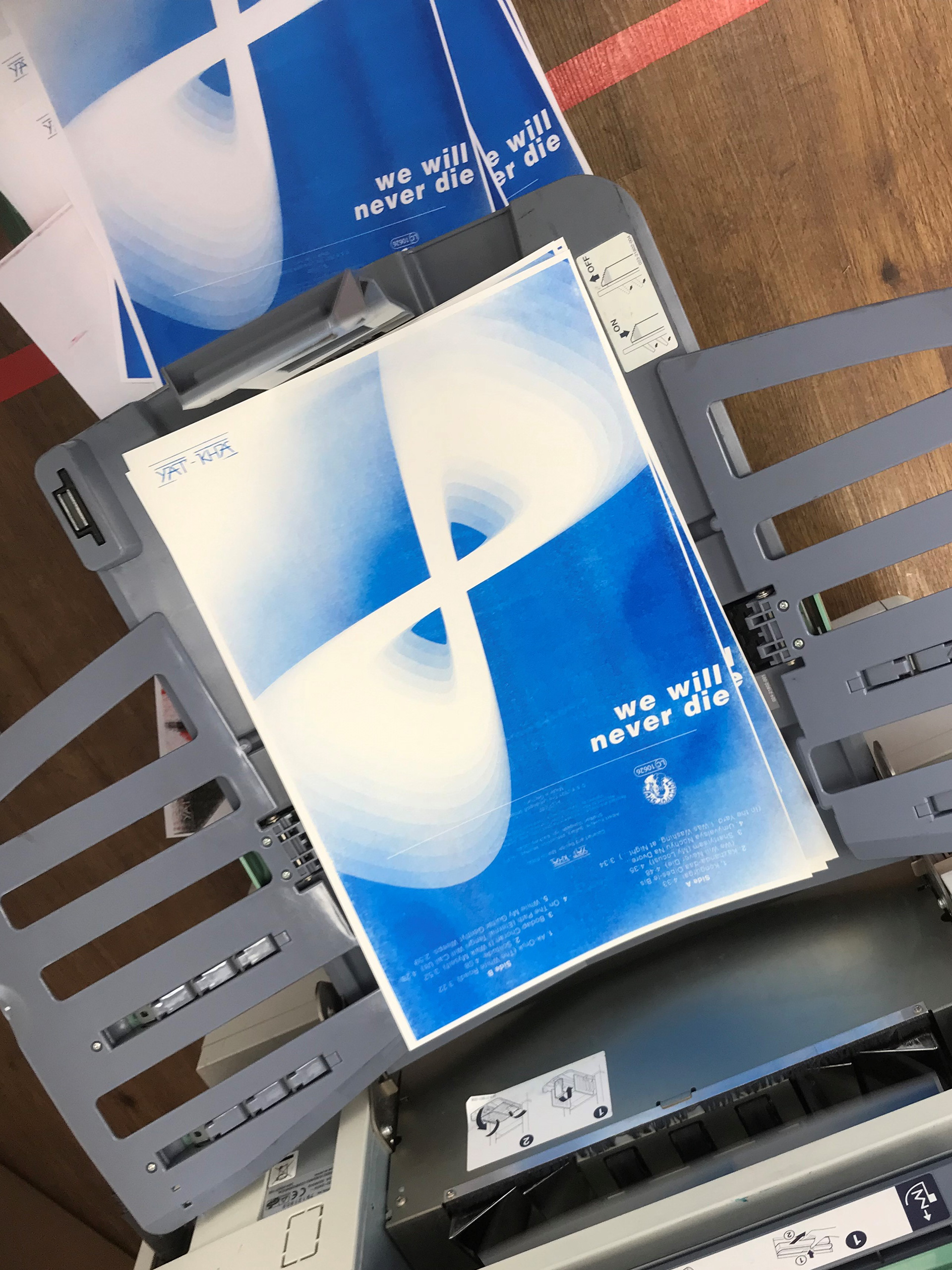
Here you can see a few pictures from the printing process that my professor took:
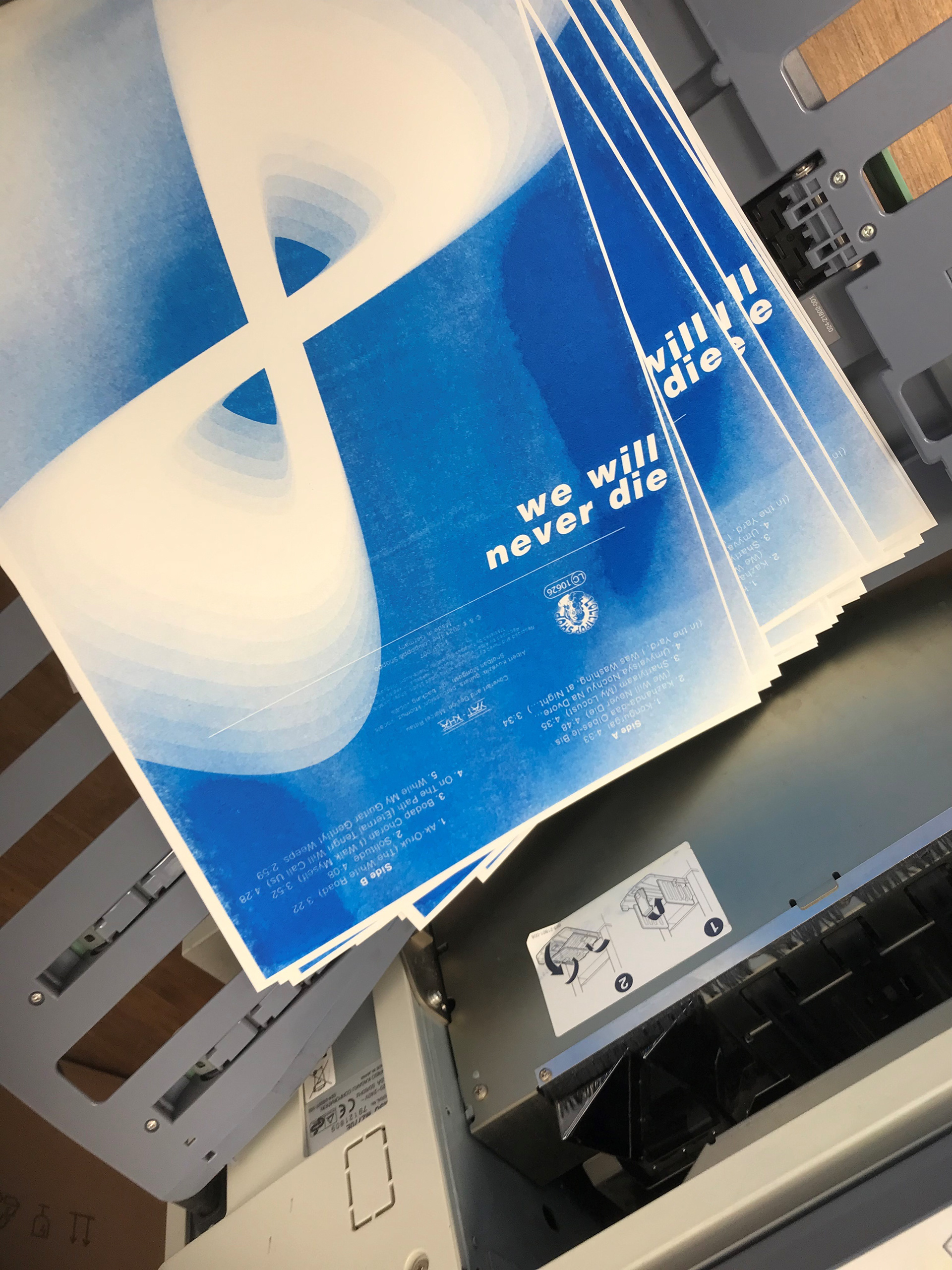
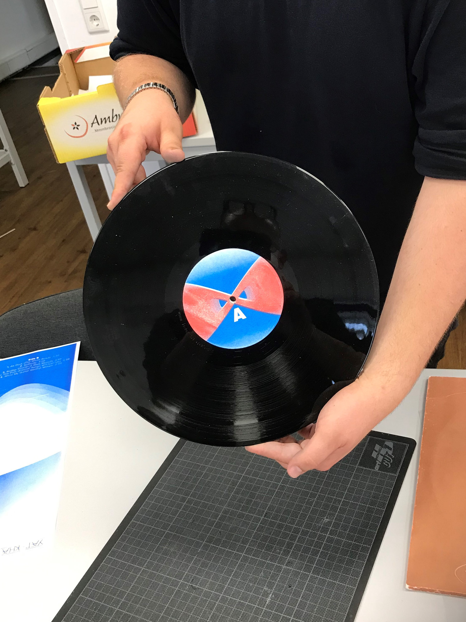
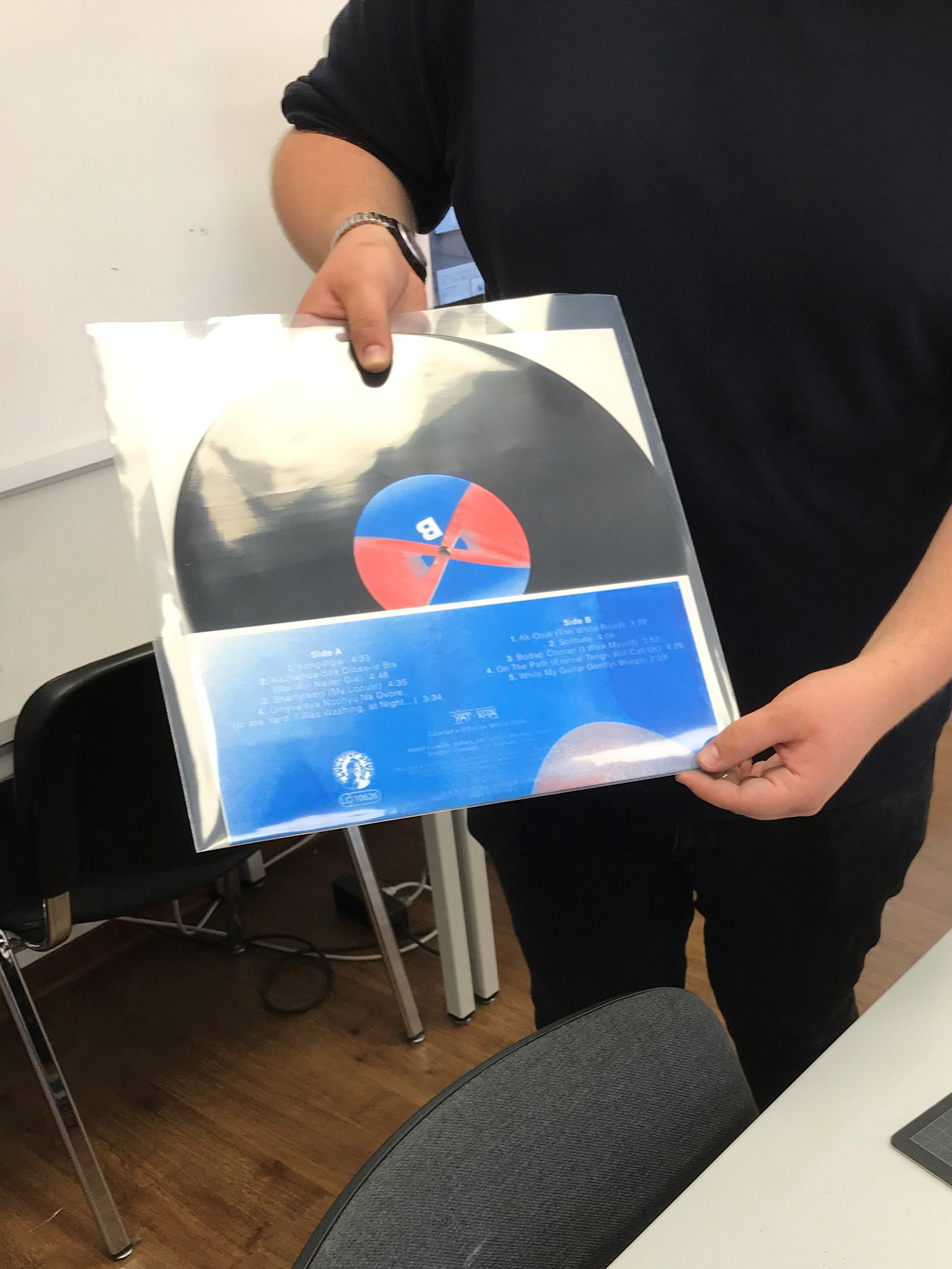
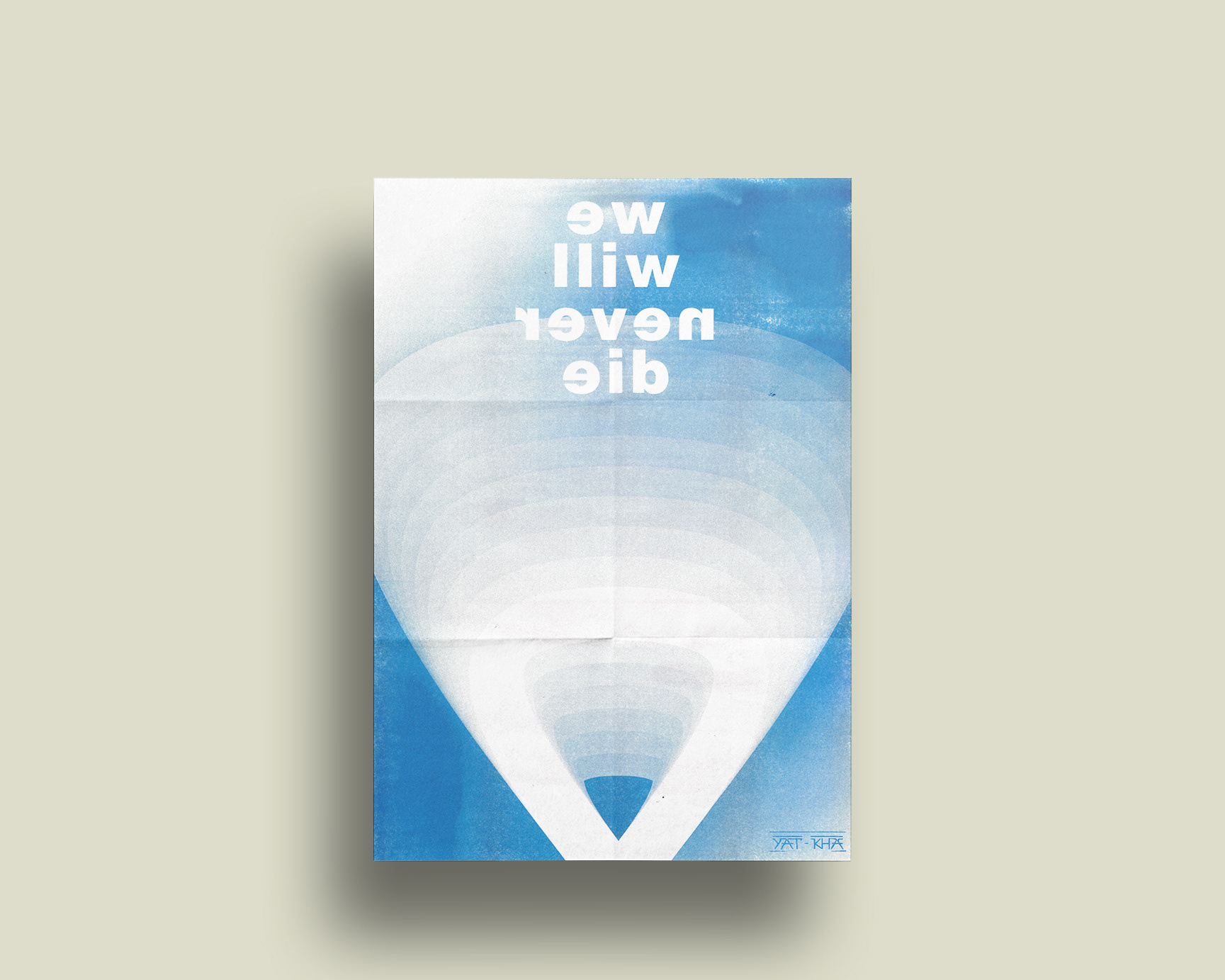
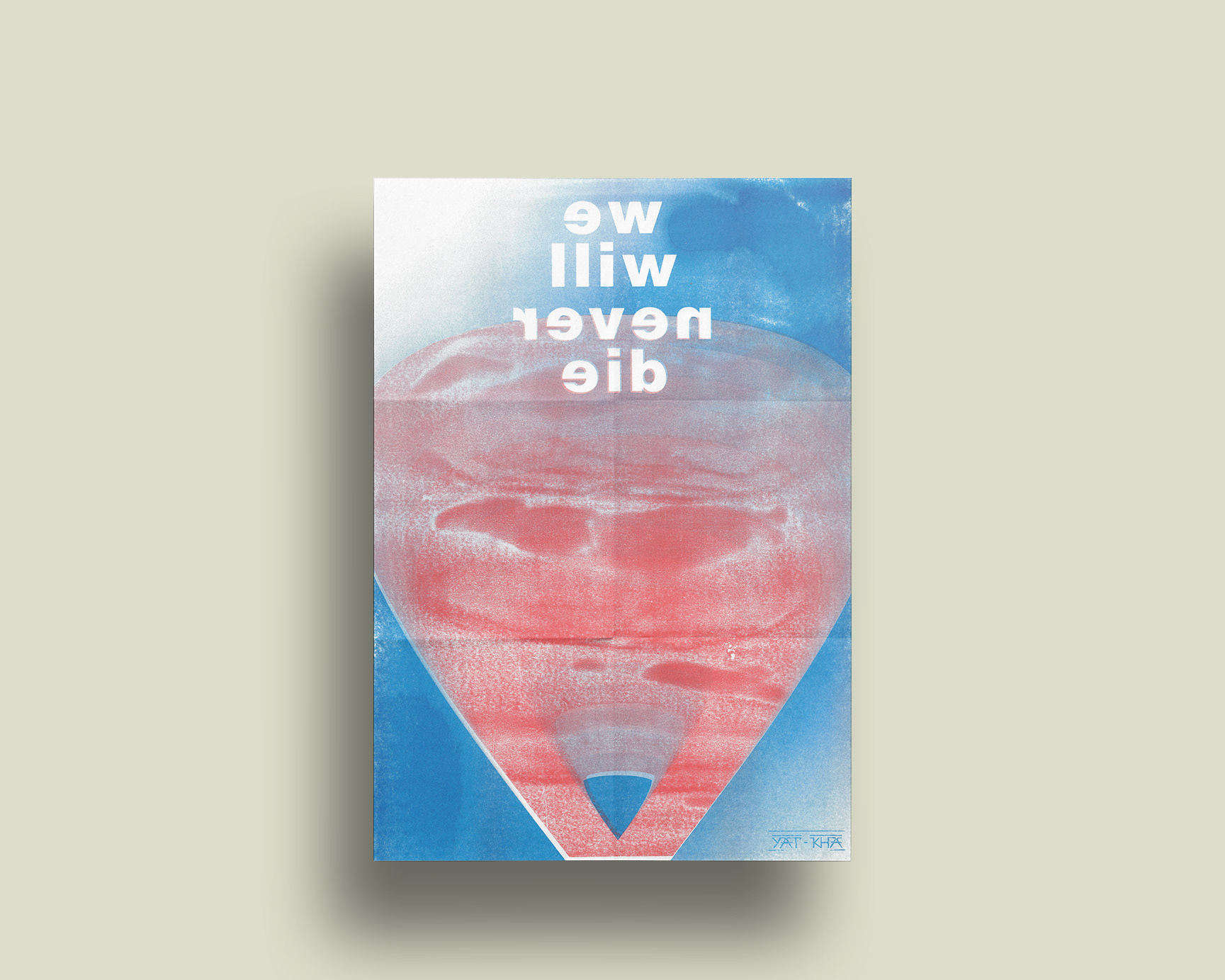
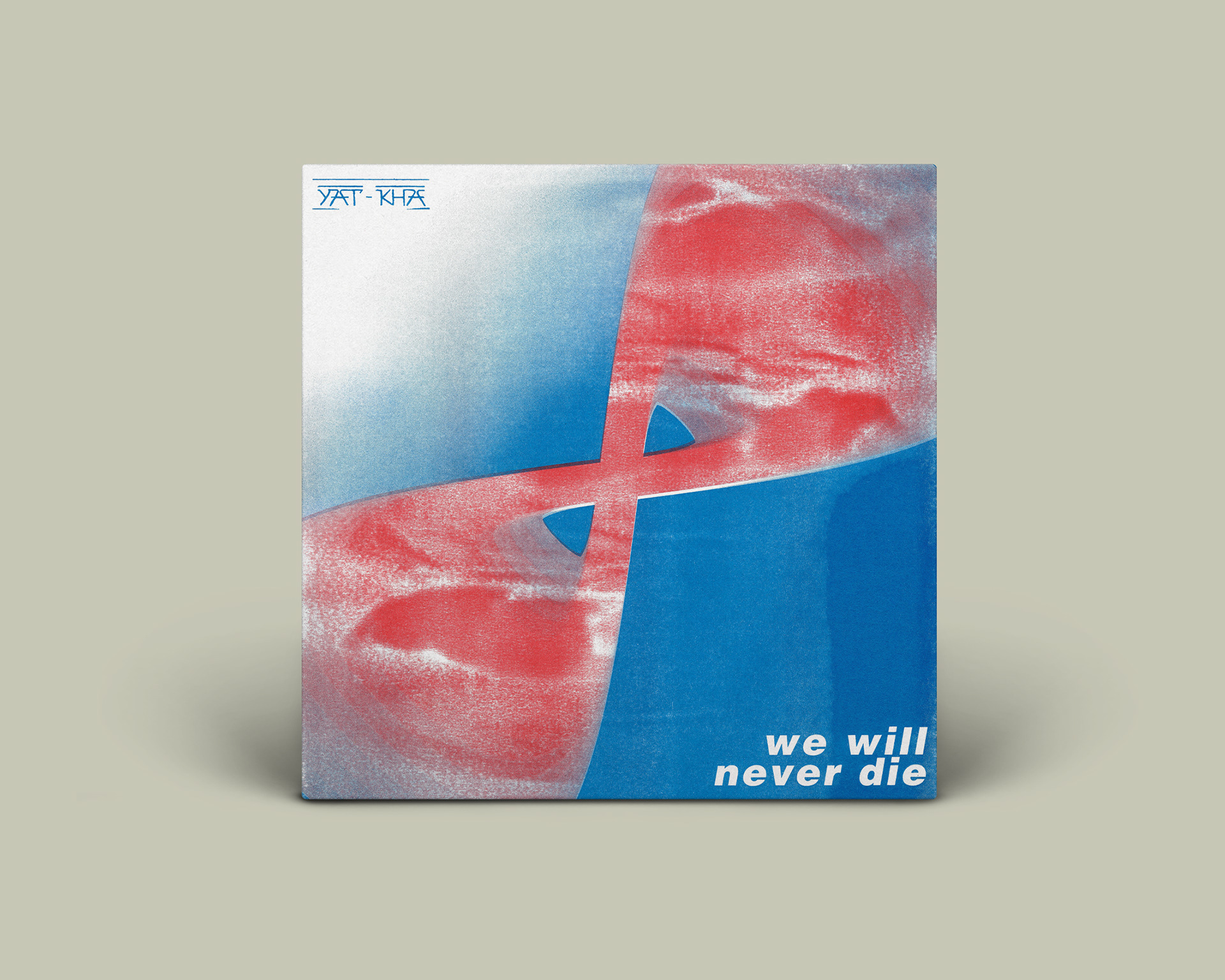
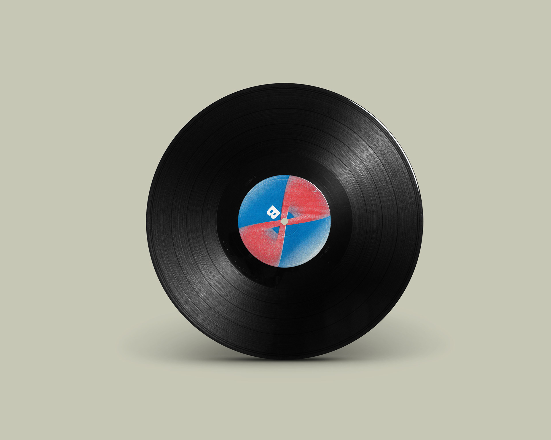
While we were in dialogue with Yat-Kha, I asked what the title of the album meant to them. Mr. Kuvezin described it as a statement - the statement that the band truly will never die because of its music and thus perpetuates itself into eternity. It was that thought whicht I wanted to reflect in my design, the gradient represents fading of a memory but the infinity of the music clearly in the foreground. The red should represent the contrast, after some alterations it was also possible with white, so thereupon two versions were created. Lollipop Shop then selected, among others, my print to appear in limited edition. (Discogs - YatKha)
For the two versions I then also created matching posters.